[twentytwenty]

 [/twentytwenty]
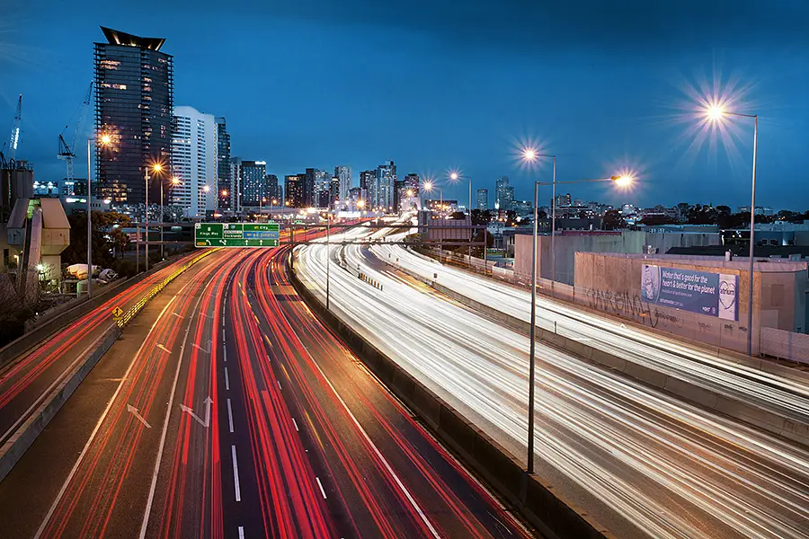
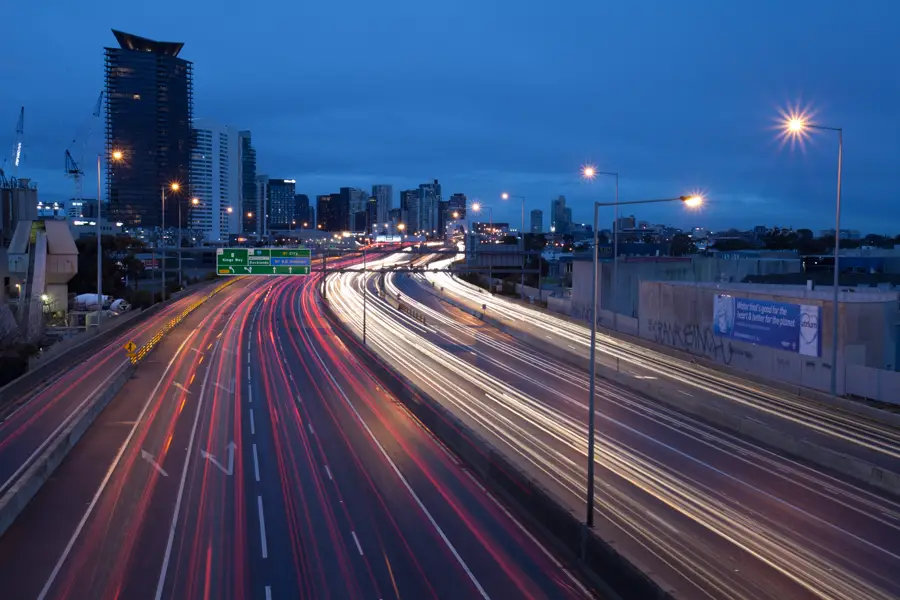
Driving around Port Melbourne on a rainy Sunday with Jon Sander last winter, we stumbled across this overpass that provides a great view of one of Melbourne’s busier highways. We were fortunate that the overpass was quiet and isolated away from the traffic below making its way in and out of Melbourne.
So… The photo you see is actually a composite of three images. One image formed the base with an additional two images being used to exaggerate the amount of traffic. Sure, I could have kept the shutter open for longer but to be honest – I am slightly pedantic when it comes to these things. Sometimes it can be easier to capture the base image and snap seperate frames when you see a large lump of traffic or a truck coming. Using layer-masks makes dropping the additional traffic into the frame quite easy. Over the top? Probably.
When it came to the colour grading of the image, I wanted to keep the cold feel from the day (keeping the sky looking cold and gloomy) but wanted some warmth to parts of the image. Using layer masks and a warmer temperature, I warmed the bottom half of the image while leaving the top half of the frame with a cold feel (using a layer mask to ensure the top half remain untouched).
For the remainder of the image, I used a range of dodge and burning to:
- Bring out the star effect in the lights
- Lighten the surrounding buildings
- Add mood to the sky
And that’s that 🙂 Apologies that this post isn’t glamorous with interesting information. It wasn’t the most complex scene or photo to edit. The only trickery here was around the multiple layers used to exaggerate the flow of traffic.
If you have any questions, be sure to comment or drop an email!
Alex

Beautiful work.
The exaggeration on the traffic, light trails, really pops with the additional layering.
Thanks Chester for stopping by 🙂